Safe Font Combos
filed under game design and layout on 04 Jun 2021 tagged fonts and layout
To my mind, the safest option is a standard serif font paired with itself or a sans family version of itself as a header. When you do this, use a hierarchy of sizes (13pt, 15pt, 17pt, and 22pt are good rules of thumb for a 10pt body font) to emphasize differences, rather than a separate header font. No one will remark on your typography, but the drawback, of course, is that it is standard and can be a little boring.
All the fonts showcased on this page should be free and openly licensed.
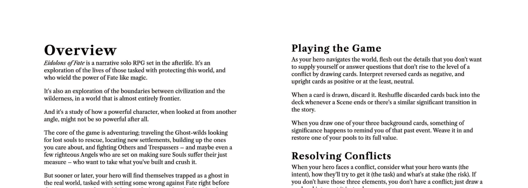
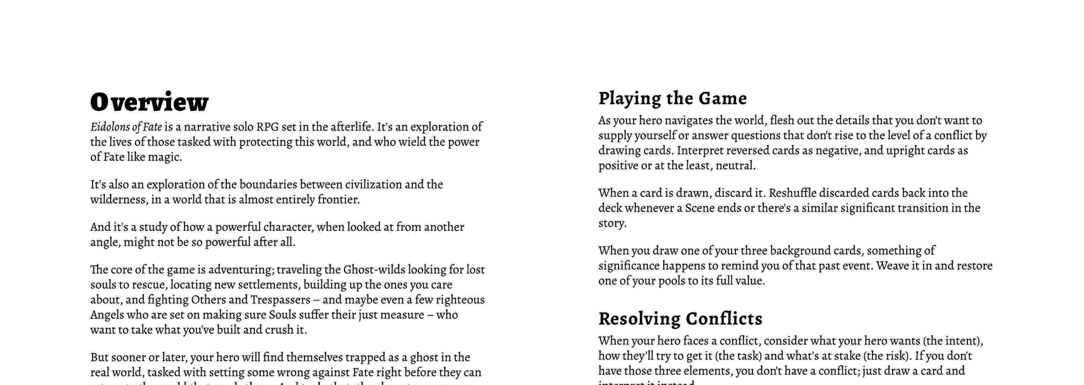
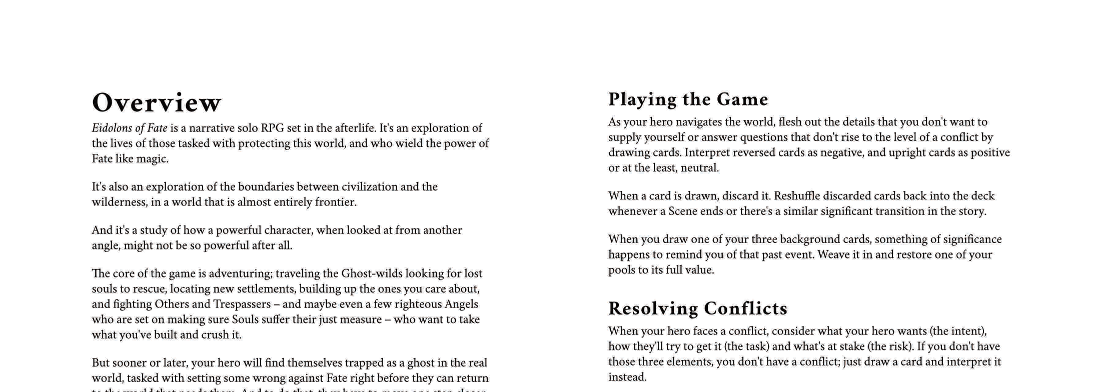
Body: Qualitype Caslan, EB Garamond, Alegreya,
1 Libre Caslon Text. You probably can’t go wrong using a Caslon font. I prefer the QT version but here’s a google fonts version.
2 Alegreya. Alegreya is a newer font but one that looks very classic. Pair it with itself, or with the sans version, or with Datalegreya.
3 Cochineal. Cochineal is a serif font built on Crimson Pro, also an excellent choice.
Next up: some of my favorites.
