Pretty Fantasy Fonts
filed under game design and layout on 18 Jun 2021 tagged fonts and layout
Fantasy games cover a wide number of tones, from dark and gritty to light and whimsical, and everything in-between, and an equally wide number of niches, from OSR to 5e to pbta. Always look to your own tone, your own niche, and your own tastes here, but these are some fonts I look to when laying out a fantasy work.
Something to keep in mind is that readability is key, and you don’t want to pastiche yourself with ye old time fonts. Save super themed fonts for small touches or don’t use them at all. And watch for fatigue, where a font combination that looks great on day one starts to look tired and too themed on day 45 of a project – the font hasn’t changed.
All the fonts on this page should be free and openly licensed.
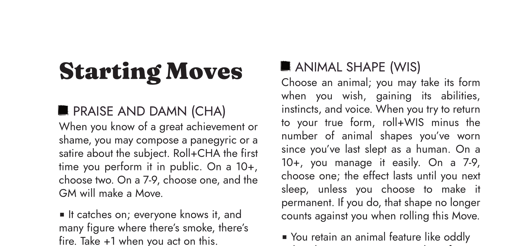
Headers: Oswald, Aurelius ADF, Beholden.
Body: Clara, Lora, any of the serif body fonts in this series so far. Consider Irianis ADF or Averia Gruesa if you want to set off a quotation or small amount of leading fiction.
1 Fraunces and Jost Old school without being dated or fussy, or relying on ye old font. This borders on a sans header with classic text, but reversed it feels more classic RPG to me. Fraunces is reminiscent of the mid-70s but fresh, and comes in a million weights, while Jost as a body font reads as very AD&D. Consider Istok Web in place of Jost.
2 Foglighten & Vollkorn. Vollkorn is one of those fonts people just like; it has italics, small caps, plenty of nice touches, and works for body text and for headers. Foglighten comes in about 7 variants, ranging from slightly swirly to serious gaslamps vibes. No italics, or I’d use it for a body font too. They’re perfect together, in multiple combinations, depending on how “Victorian” you want to go versus “fantasy industrial revolution”.
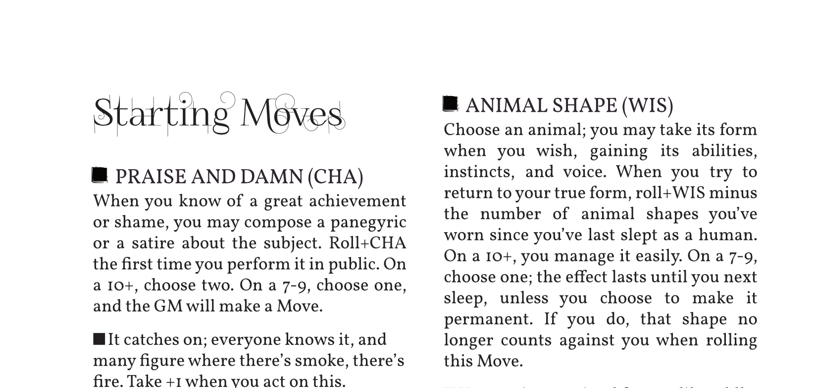
3 Romande ADF & Clara. Clara is a pretty font that reminds me of Times New Roman. Romande ADF is not the most swashy font, but gets the point across – and it has a small caps and a regular version as well. For this particular combination, I might replace the header (“Advanced Moves”) with a third, more decorative font, as it’s repeated just three times across a four page spread.